pryanicom
Ever scrolled past a pixelated profile picture or an awkwardly cropped cover photo and felt an immediate, albeit subconscious, drop in perceived quality? In 2026, where visual communication reigns supreme, the specifications for social media imagery are in a constant state of flux. Platforms frequently refine their algorithms and introduce new features, which often means a silent shift in optimal image dimensions. This dynamic environment presents a persistent challenge for marketers: how to consistently present a brand’s visual identity with clarity and impact when the goalposts keep moving.
Ignoring these subtle yet significant shifts is a critical misstep. Correct social media image sizing isn’t merely about aesthetics; it’s the bedrock of a compelling online presence. Precision in your visuals directly translates to enhanced professionalism, ensuring your brand appears polished and credible. It fuels engagement, as perfectly scaled images load faster and display flawlessly, capturing attention rather than frustrating it with distortion. Moreover, accurate sizing is fundamental to effective brand messaging, guaranteeing that your carefully crafted visuals convey their intended story without unwelcome cropping or resolution loss. Ultimately, it contributes to content longevity, creating assets that remain impactful and relevant, resisting the rapid obsolescence that poorly optimized visuals often face. This isn’t just about fitting a square peg in a round hole; it’s about optimizing every visual touchpoint for maximum effect.

Essential Image Sizes for Every Social Platform (December 2025)
Navigating the labyrinth of social media image specifications can feel like a perpetual chase, with platforms constantly tweaking their algorithms and display parameters. Yet, mastering these precise dimensions isn’t just about avoiding awkward cropping; it’s a foundational pillar for any brand aiming to cut through the noise. This detailed guide arms you with the exact pixel counts and aspect ratios needed to ensure your visuals consistently shine, no matter where they appear.
Understanding and meticulously applying the correct social media image sizes is paramount for maintaining a professional brand image, maximizing engagement, and ensuring your brand messaging is delivered without visual compromise. This diligence also contributes significantly to the longevity and impact of your content, preventing pixelation or distortion that can dilute your efforts over time.

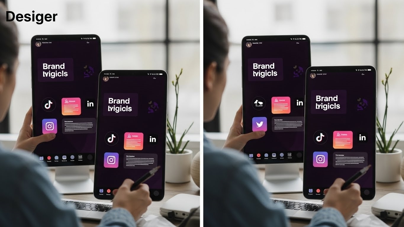
Instagram Image Dimensions
Instagram remains a visual powerhouse, and pixel-perfect imagery is non-negotiable.
| Image Type | Dimensions (px) | Aspect Ratio | Notes |
|---|---|---|---|
| Profile Photo | 320×320 (min) | 1:1 | Displays as a circle. |
| Square Post | 1080×1080 | 1:1 | Ideal for maximum feed visibility. |
| Landscape Post | 1080×566 | 1.91:1 | Wider than tall. |
| Vertical Post | 1080×1350 | 4:5 | Taller than wide, popular for feed impact. |
| Carousel Posts | 1080×1080 (1:1) | 1:1, 1.91:1, 4:5 | Maintain consistent aspect ratio per carousel. |
| Stories & Reels | 1080×1920 | 9:16 | Safe zones: keep critical elements within 1080×1420 (top/bottom 250px often obscured). |
| Ad Specifications | Varies | 1:1, 1.91:1, 9:16 | Align with organic post/story dimensions. |
Facebook Image Dimensions
Facebook’s diverse placements demand adaptable visuals, especially considering desktop versus mobile rendering.

| Image Type | Dimensions (px) | Aspect Ratio | Notes |
|---|---|---|---|
| Profile Photo | 170×170 (desktop) | 1:1 | Displays as a circle. |
| Cover Photo | 820×312 (desktop) | 2.63:1 | Safe zones: 640×360 (mobile), 75px top/bottom often cropped. |
| Timeline Post | 1200×630 (link) | 1.91:1 | Optimal for shared links. |
| Timeline Post | 1200×1200 (square) | 1:1 | Strong engagement for standalone images. |
| Stories | 1080×1920 | 9:16 | Full-screen vertical. |
| Ad Formats | Varies | 1.91:1, 1:1, 9:16 | Match ad type (feed, story, carousel). |
X (formerly Twitter) Image Dimensions
X thrives on immediate visual impact. Your images need to be sharp and correctly proportioned.
| Image Type | Dimensions (px) | Aspect Ratio | Notes |
|---|---|---|---|
| Profile Photo | 400×400 | 1:1 | Displays as a circle. |
| Header Image | 1500×500 | 3:1 | Wide banner, ensure key elements are centered. |
| In-Stream Photo | 1600×900 (landscape) | 16:9 | Common for sharing articles/links. |
| In-Stream Photo | 1200×1200 (square) | 1:1 | Great for standalone images. |
| In-Stream Photo | 1200×675 (vertical) | 16:9 | Displays well in feed. |
| GIF | Max 15MB | Varies | Max 5MB for photos. |
| Ad Formats | Varies | 1.91:1, 1:1 | Tailor to specific ad objectives. |
LinkedIn Image Dimensions
Professionalism dictates precise visuals on LinkedIn, from personal branding to company pages.

| Image Type | Dimensions (px) | Aspect Ratio | Notes |
|---|---|---|---|
| Personal Profile | 400×400 (min) | 1:1 | Professional headshot. |
| Personal Cover | 1584×396 | 4:1 | Often cropped on mobile; keep content central. |
| Company Logo | 300×300 | 1:1 | Essential for brand recognition. |
| Company Cover | 1128×191 | 5.9:1 | Wide, impactful banner. |
| Post Image | 1200×627 | 1.91:1 | Optimal for shared content. |
| Post Image | 1200×1200 | 1:1 | Strong for direct image posts. |
| Carousel Ads | 1080×1080 | 1:1 | Engage with multiple slides. |
Pinterest Image Dimensions
Pinterest is a visual discovery engine; vertical, high-quality images are king.
| Image Type | Dimensions (px) | Aspect Ratio | Notes |
|---|---|---|---|
| Profile Photo | 165×165 (min) | 1:1 | Displays as a circle. |
| Standard Pin | 1000×1500 | 2:3 | The ideal aspect ratio for feed visibility. |
| Long Pin | 1000×2100 | 1:2.1 | Can be effective, but 2:3 is generally preferred. |
| Collections Pin | 1000×1000 (main) | 1:1 | Main image for product collections. |
| Collections Pin | 1000×1500 (sub) | 2:3 | Sub-images within a collection. |
| Ad Dimensions | 1000×1500 | 2:3 | Consistent with organic pins. |
Snapchat Image Dimensions
Snapchat’s ephemeral content demands full-screen, vertical visuals.

| Image Type | Dimensions (px) | Aspect Ratio | Notes |
|---|---|---|---|
| Profile Photo | N/A | N/A | Bitmoji-based, no direct image upload. |
| Banner Image | 360×600 (Geofilters) | 3:5 | Specific to Geofilter creation. |
| Ad Specifications | 1080×1920 | 9:16 | Safe zones: 175px top/bottom, 60px sides. |
YouTube Image Dimensions
Visuals on YouTube extend beyond video, impacting channel branding and discoverability.
| Image Type | Dimensions (px) | Aspect Ratio | Notes |
|---|---|---|---|
| Profile Photo | 800×800 | 1:1 | Displays as a circle. |
| Banner Image | 2560×1440 (min 2048×1152) | 16:9 | Safe area: 1235×338 (visible on all devices). |
| Video Thumbnail | 1280×720 | 16:9 | Crucial for click-through rates. |
| Podcast Playlist Thumbnail | 1280×1280 | 1:1 | For audio-focused content. |
TikTok Image Dimensions
TikTok’s short-form video dominance means vertical content is king, but ads offer flexibility.

| Image Type | Dimensions (px) | Aspect Ratio | Notes |
|---|---|---|---|
| Profile Photo | 200×200 (min) | 1:1 | Displays as a circle. |
| Video Dimensions | 1080×1920 | 9:16 | Full-screen vertical, standard for organic. |
| Ad Formats | 1080×1920 (9:16) | 9:16, 1:1, 16:9 | Also supports square and landscape for specific ad types. |
Bluesky Image Dimensions
As a newer contender, Bluesky offers straightforward image guidelines.
| Image Type | Dimensions (px) | Aspect Ratio | Notes |
|---|---|---|---|
| Profile Photo | 1000×1000 (min 256×256) | 1:1 | Clear, square profile image. |
| Banner Image | 1500×500 | 3:1 | Channel header. |
| Post Image | 2000×1500 (landscape) | 4:3 | Up to 4 images per post. |
| Post Image | 1500×2000 (vertical) | 3:4 | Also supported. |
| Post Image | 1500×1500 (square) | 1:1 | Versatile option. |
Threads Image Dimensions
Threads, integrated with Instagram, largely mirrors its parent platform’s visual requirements.

| Image Type | Dimensions (px) | Aspect Ratio | Notes |
|---|---|---|---|
| Profile Photo | 320×320 (min) | 1:1 | Inherited from Instagram. |
| Post Image | 1080×1080 (square) | 1:1 | Standard for single images. |
| Post Image | 1080×1350 (vertical) | 4:5 | Taller, impactful posts. |
| Post Image | 1080×566 (landscape) | 1.91:1 | Wider images. |
| Carousel Options | Up to 10 images | 1:1, 4:5, 1.91:1 | Mix and match aspect ratios within a carousel. |
Mastering Visuals: Strategic Image Optimization
Crafting compelling visuals for social channels transcends merely hitting the right pixel dimensions. It demands a strategic approach to image quality, aspect ratios, and placement, ensuring your content maintains its integrity and impact across diverse viewing environments. This isn’t just about avoiding blurry uploads; it’s about safeguarding your brand’s visual voice.
Image Quality: The Visual Foundation
The journey to impeccable social imagery begins with the source file. While platforms each have their recommended dimensions, a fundamental principle holds true: start with the highest quality image possible. When platforms ingest your content, they often apply their own compression algorithms, which can introduce artifacts or degrade sharpness. Providing an image with ample resolution—think an optimal width of at least 1200 pixels, often pushing to 2048 pixels for maximum fidelity before scaling—gives the platform more data to work with, resulting in a cleaner, crisper final display.

Understanding file types is equally critical. Each serves a distinct purpose:
| File Type | Best Use Case | Key Characteristic |
|---|---|---|
| JPG | Photographs, intricate gradients, complex scenes | Excellent for color depth, efficient lossy compression |
| PNG | Graphics, logos, text overlays, transparent backgrounds | Ideal for sharp edges, lossless compression, supports transparency |
Choosing the correct format prevents unnecessary file bloat or, conversely, a loss of detail where it matters most. A logo with crisp lines, for instance, demands PNG’s lossless precision, while a vibrant product shot thrives as a JPG.

Aspect Ratios and Safe Zones: Precision Cropping
The digital canvas is rarely a static rectangle. Images are dynamically resized, cropped, and overlaid with user interface elements. This necessitates a keen awareness of aspect ratios and the often-overlooked concept of safe zones. An aspect ratio defines the proportional relationship between an image’s width and height (e.g., 1:1 for a perfect square, 9:16 for a vertical Story). Adhering to these ratios prevents awkward cropping that can sever heads, truncate text, or obscure key product features.
Beyond simple ratios, safe zones are invisible boundaries within your image where critical content must reside to guarantee visibility. Consider a cover photo that displays differently on desktop versus mobile, or a Story that gets partially covered by a user’s profile icon and interaction buttons. Designing with these zones in mind means placing your primary subject, brand logo, or call-to-action within the central, universally visible area. This proactive approach ensures your message remains intact, regardless of how or where it’s viewed.

Specific Image Types: Tailored Visuals
Each image type on social platforms presents unique optimization challenges and opportunities.
- Profile Photos: These are often cropped into a circle. The key here is perfect centering. Ensure your face or brand logo occupies the absolute center of the square image you upload, with sufficient padding around it to accommodate the circular crop without feeling cramped or cut off.
- Cover Photos: These are notorious for their adaptability demands. They stretch and shrink across vastly different screen sizes. The most effective strategy is to design with a “center-heavy” approach. Place all essential information—your brand name, a key message, or a central visual—within the horizontal middle section, anticipating that the outer edges may be trimmed on smaller screens.
- Stories and Reels: These full-screen, vertical formats (typically 9:16) are prime real estate for immersive content. However, they come with built-in UI elements that can obscure your message. Account for the top and bottom “dead zones” where usernames, profile pictures, interaction buttons, and swipe-up indicators reside. Position text, calls to action, and critical visual elements within the central safe area, away from these interactive overlays. This ensures your audience sees your entire message, unimpeded, maximizing engagement and clarity.
Streamlining Visuals: Sizing for Impact and Efficiency
In the relentless current of social content, visual integrity isn’t merely a nicety; it’s a strategic imperative. Adhering to the precise image specifications for each platform isn’t about appeasing algorithms, though that’s a welcome byproduct. It’s fundamentally about respecting your audience’s experience and fortifying your brand’s digital footprint. When an image loads perfectly, without awkward cropping, pixelation, or distorted aspect ratios, it communicates professionalism and meticulous attention to detail. This visual precision translates directly into enhanced brand presence, fostering a seamless, high-quality interaction that builds trust and connection.

Consider the alternative: a hastily uploaded image, stretched on one platform, awkwardly cropped on another, and barely legible on a third. This inconsistency erodes credibility, distracts from your core message, and signals a lack of care. Conversely, a consistently optimized visual across every touchpoint reinforces brand identity, making your content instantly recognizable and more engaging. It ensures your message, whether a product launch or a thought leadership piece, is delivered exactly as intended, maximizing its impact and fostering deeper audience engagement. This isn’t just about aesthetics; it’s about optimizing every micro-moment of interaction for maximum resonance.
Integrated Tools Simplify Sizing
The challenge, historically, has been the sheer complexity of managing diverse image requirements across an ever-expanding array of social platforms. Manually resizing a single asset for Instagram, Facebook, X, LinkedIn, and Pinterest could consume valuable creative time, often leading to errors or compromises. Fortunately, the 2026 content creation ecosystem offers powerful integrated solutions that transform this arduous task into a streamlined workflow.
One standout example is the synergy between Hootsuite Composer and Canva. This integration exemplifies how platforms are evolving to meet the demands of modern marketers. Within Hootsuite’s publishing interface, users can directly access Canva’s robust design capabilities. This means an asset created once can be instantly adapted for multiple platforms using Canva’s magic resize feature, which offers pre-set dimensions for virtually every social media format.
This integration offers several profound advantages:
- Efficiency: Eliminate the tedious back-and-forth between separate applications. Design, resize, and schedule all within a unified environment.
- Consistency: Maintain brand guidelines effortlessly. A single source asset can be precisely tailored without compromising visual elements or brand messaging.
- Accuracy: Leverage platform-specific templates and automated resizing to ensure every image meets the exact specifications, avoiding unexpected cropping or quality degradation.
- Accessibility: Empower team members, regardless of their design proficiency, to produce professional-grade visuals consistently.
The table below illustrates the stark contrast between traditional manual methods and the efficiency offered by integrated solutions:
| Feature | Manual Resizing Workflow | Integrated Tool Workflow (e.g., Hootsuite + Canva) |
|---|---|---|
| Time Investment | High: Repetitive actions for each platform | Low: One-click adaptation across platforms |
| Consistency | Prone to variations, potential for errors | High: Automated, template-driven precision |
| Error Rate | Moderate to High: Easy to miscalculate dimensions | Low: Pre-set, verified dimensions |
| Design Skill Req. | Moderate: Requires understanding of aspect ratios/tools | Low: User-friendly interfaces, guided templates |
| Workflow Friction | High: Context switching, file management overhead | Low: Seamless, unified environment |
Leveraging these integrated tools isn’t just about saving time; it’s about elevating the quality and consistency of your entire visual content strategy. It frees up creative energy, allowing teams to focus on crafting compelling narratives rather than wrestling with pixel dimensions. In 2026, the smart marketer understands that optimizing image sizing is no longer a chore, but an opportunity to amplify brand impact with unparalleled efficiency.
FAQ
How do images support accessibility?
Use descriptive alt text. Screen readers convey image content. This aids visually impaired users.
Do image sizes affect page speed?
Larger file sizes slow loading. This impacts user experience, search ranking. Optimize compression.
What about image copyright?
Ensure proper licensing. Use royalty-free images. Avoid legal issues.
Are new image formats emerging?
WebP, AVIF offer better compression. They improve load times. Platforms gradually adopt them.